Designed for the Marin County Breeding Bird Atlas, this application is designed to give volunteers of the Atlas real time information about the data they are collecting in the field, and compare it to the historic data from the previous atlasing effort. This application is based on the LAPP stack (Linux, Apache, Postgres, and PHP). This application is containerized in Docker and deployed to Cloud Run (a stateless container PAAS). This application can autoscale upwards to handle spikes in traffic and can scale down to zero instances to save on resources. It is connected to github via Cloud Build for CI/CD allowing me to push updates for instant integration of new code. The Postgres database is hosted on a virtual machine, which has data pipelines coming from multiple sources via R scripts.
This map uses HTML and CSS to style the page, the JavaScript to display the map, PHP to connect to the Postgres database, and SQL to query the database. The Postgres database also has expanded spatial analysis functionality through the PostGIS extension, allowing for SQL queries to take on some of the spatial processing. Want to check out a sample the SQL used in this web map? I've included it at the bottom of this page. Want to see this app in action on the project site? Check it out here: Marin Audubon.
Looker Studio Dashboards (formally Data Studio)
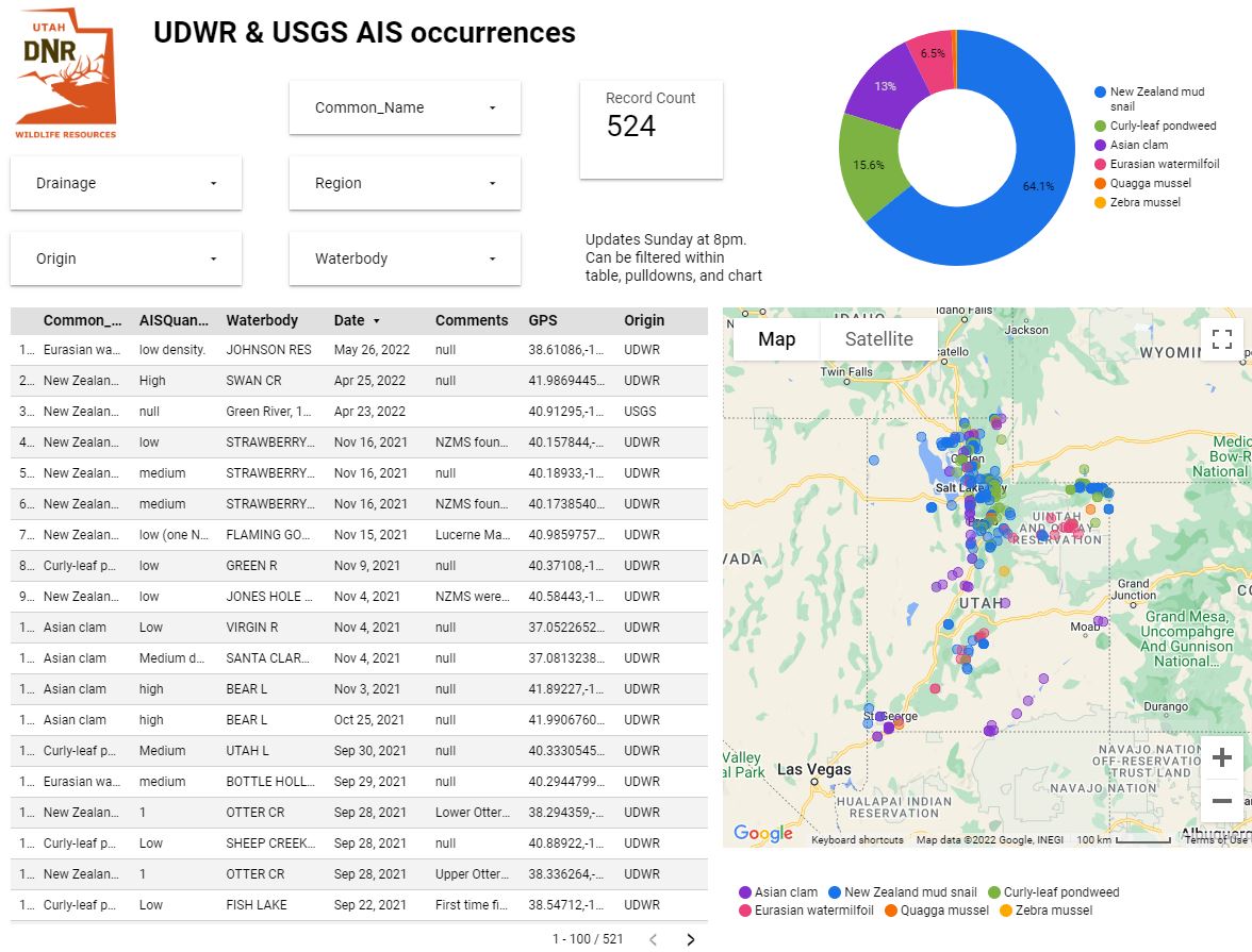
Looker Studio is a dashboard creation tool developed by google. This fast and easy solution can be connected quickly to any data source hosted in a google product, such as CloudSQL, BigQuery, Google Sheets, and Google Analytics. Basic analysis is achieved through pre-built widgets; advanced data wrangling is done through standard SQL. Shown here is a dashboard I made for the Division of Wildlife Resources in Utah.
This dashboard shows where invasive aquatic species have been found in state waterbodies. I pipeline the data from three sources; 1) The State of Utah has field crews tracking data in ArcGIS Online via a Survey123, 2) USGS data is available via a public API, and 3) data gaps of known invasive species can be manually entered into google sheets by project leaders. I automate the data wrangling from the first two sources using Cloud Functions and warehouse them in BigQuery. I then union the three sources into a view using SQL and built this dashboard from the view.
The second link below is a dashboard simply built off of google sheets. It displays where we have found specimens that has tested positive for the 2022 outbreak of Avian Influenza. The 3rd link is a powerpoint I made describing the Guzzlers architecture I designed for State of Utah, unfortunately these data are protected so the Guzzlers dashboard cannot be shared.
Spatial Data Science
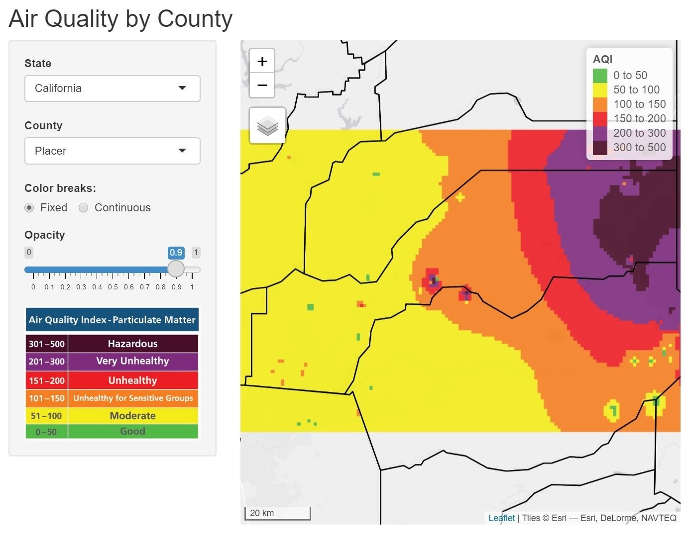
Pictured here is an app I wrote in the R programming language to visualize air quality data. This app reads in air quality data being streamed from Purple Airs API. Then I derive a raster surface interpolation based on the sensor values of each instrument using the inverse distance weighted (IDW) method.
These applications were a good start, but I wanted an app that could display the air quality anywhere in the United States. So I attached an API I built for serving up county lines, and made the IDW interpolation reactive. I also averaged the AQI readings within each county. I encountered some server errors simply because of the massive amount of data this app was handling, which I solved by loading in the data state-by-state.
Exploring Timeseries Data
The shiny app above is awesome at processing massive amounts of real-time data, but what if you want to look at historic data? Purple Air doesn't provide a database for historic data, so I decided to build my own. Nightly, I hit the Purple Air API for data using a scheduled Python script run serverlessly on Cloud Functions. This script brings in the ~23,000 Purple Air sensors each averaged to their previous 24 hours of data. However, this is too many records for me to store daily, even in BigQuery, and really I'm only interested in summaries of the sensors by county. Next, I bring in county data from the same county API used in the shiny app. Then, using the Lat/Long for each sensor, I aggregate the median values of the sensors for each continental United States county. Median is a much better metric when data are skewed, which air quality data often is. Then I warehouse this data in BigQuery and build the dashboard from there. This script takes less than 30 seconds to run and uploads data for all 3,108 counties in the continental USA. Even aggregating this data down to a few thousand records adds up fast when appending data nightly, and every 321 days a million records are warehoused in my database! At the bottom of the dashboard you can find a timeseries of the data, which can also be used for filtering and looking at only a specific time frame. Other filters include filtering by state or by a range of AQI values.
This graph was made through a nightly scheduled query to subset the full dataset for a quick-to-view simplified example. Using a window function in my query I filter to only the 3 counties with the highest AQI and offload them to cloud storage as a csv where I then read them into plotlyJS. This is just to create a fast-loading subset, and placing the data in cloud storage is far more cost-effective than hitting the database directly, expecially when super fresh data aren't needed. Please follow the link above to dig into the full dataset.
Displaying Shorebird Surveying Efforts
The Great Salt Lake Ecosystem Program (GSLEP), which is part of the Utah Division of Wildlife Resources, manages the avian and aquatic communities of the Great Salt Lake.
I made this map (and surveyed for the birds!) as part of a collaborative effort between the Utah Division of Wildlife Resources and National Audubon. This survey was a small part of the Intermountain West Shorebird Surveys which is an avian survey for shorebirds in the Western USA.
This map is designed to be iframed into multiple different partner websites, as such having the viewport settable by the user was an important component of this project - since different partners may use different stylings and layout. As such I built this map to take a query string as part of the http address to set the location and zoom. For example to set the view to New Zealand, all the user would have to do is include the following in the address inserted in the iframe:
?lat=-41.5&lng=171&zoom=5.75
This map uses Firebase for hosting, CI/CD through github, and leaflet/jquery for the front end.
Exploring Species Distribution Models
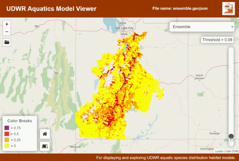
This application was designed to help display and conceptualize the outputs from species distribution models (SDMs). SDM outputs have a range of values from 0 to 1, where the closer to 1 the models is, the more likely there is for that species to be present. After a model is created by an analyst (such as myself), the next step is often to hand it back to biologists to vet the model and choose a threshold at which there is likely not to be any species presence. This application is designed to help fill that need.
This application is designed to take GeoJSON as the file input. The structure of the file it is expecting is specific to the species distribution modelling workflows used at Utah Division of Wildlife Resources (a sample is provided here). Once the model is loaded the distribution of the species can be seen, and a threshold can be selected. Click on the stream segments to see attribute information and the amount each model type is represented in the segment.
Tracking visits on a map
This map shows all the locations where visitors have accessed this webpage in the last year. When a guest visits this page I harvest their IP and run it against a database of known IP locations. This information is recorded into a postgres database. I then group these entries by location and summarize this data to the most recent date. I cluster the markers to keep the map looking clean and added a custom home button so you never get lost. The 'locate' button on the bottom right zooms to the most recent visit. A chart in the upper right shows the previous 7 days of distinct visits (aggregated by IP address), to keep the UI clean the chart is loaded collapsed. Scroll to zoom has been disable so when scrolling down you never get your cursor 'stuck' on the map. Click on a cluster to zoom to it, once down to the pin-level clicking will display attribute information. Are IP addresses the most accurate way to track location? No, the locations are approximate and designed to just give an idea of the dispersion of visitors to this site. I also track visits using first-party cookies via Google Analytics. For a looker studio dashboard of my Google Analytics data check out the link below:
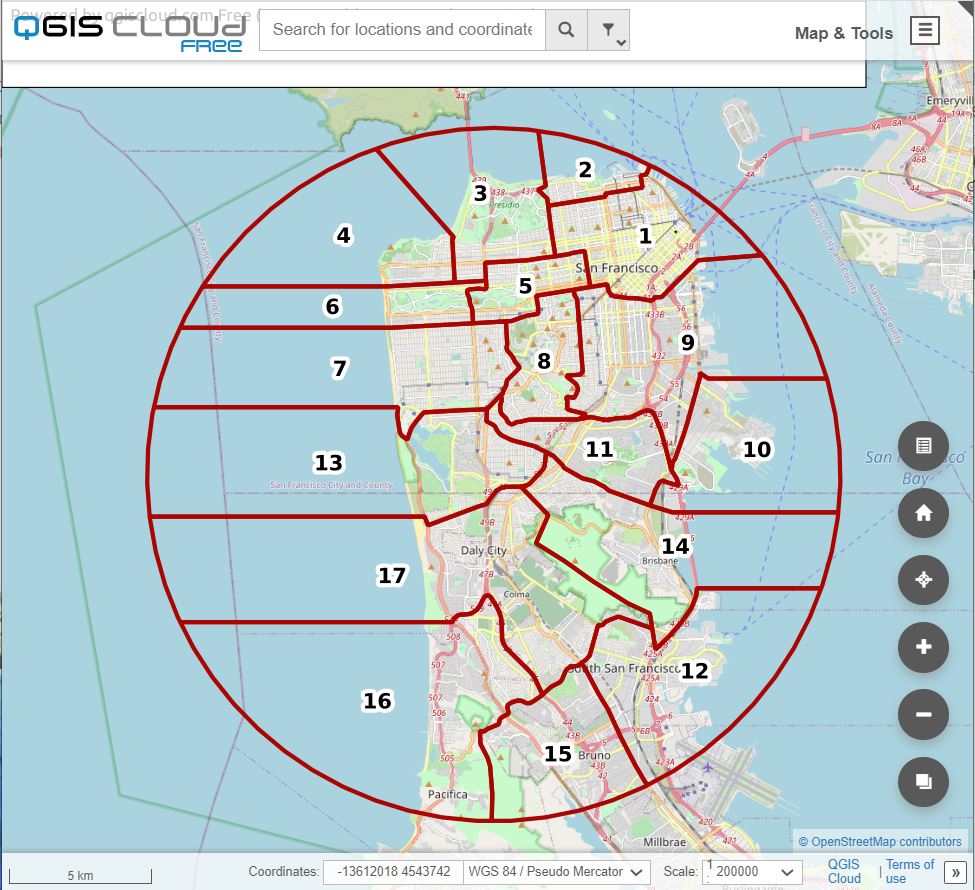
Digitizing from historic paper maps to a modern web map
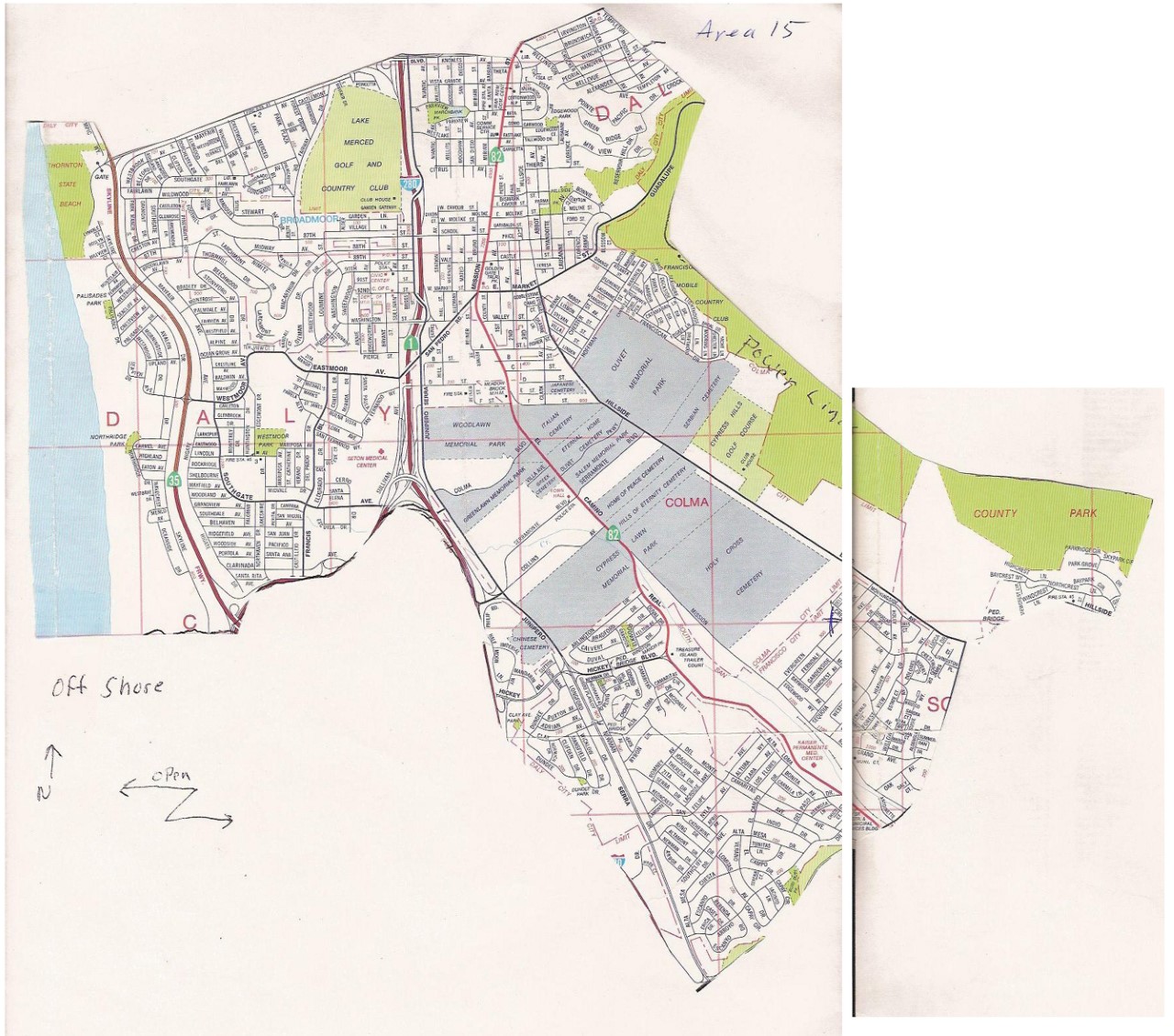 I took on this project for the San Francisco Christmas Bird Count. They had been using the same paper maps cut out of old road atlas's for years. The vast majority of the volunteers (~150 a year) had never seen the complete map - only knowing their area from their paper map. Taking the scanned maps and creating preliminary maps in ArcPro was just the first step. Some of the boundaries weren't as hard and fast as they seemed on paper, and much of the remaining work was collaborating with region leaders and adjusting boundaries as the surveyors knew them.
The link above is to the web map outlined here, however, I have since been approached to make similar maps for other Christmas Bird Counts, such as Oakland's CBC. And then I was approached by even more! Soon it became evident that a new approach was needed to store and display many different CBC maps in one place. So I wrote an app with all the tools needed to complete a CBC survey. A description of that app can be found on my programming page, or you access the app directly here:
SQL Code
This SQL query was written to populate the 'Block Data' tab of the MCBBA Data Explorer. The {$where} variable boxed in red on lines 9 and 15 is where I dynamically insert a WHERE statement to filter the results to just one survey block and set a threshold of what breeding codes will display. I use a CTE to merge the historic and current data, and coalesce the species codes for each project to make a concise single species list that can be sorted taxonomically (last line: order by id). Case statements are used to convert the numerically stored breeding codes to text. To see this code in action simply search for a block in the Block Data tab of the app at the top of this page.
Any questions at all just drop me a line, I usually respond within a couple days.